1. Make sure the mobile view option is enabled.
The option will be enabled by default in your WebSelf site but may have been disabled by accident. If this option is disabled, your website will not be optimized for mobile and will appear very small, which doesn’t offer a very good user experience.
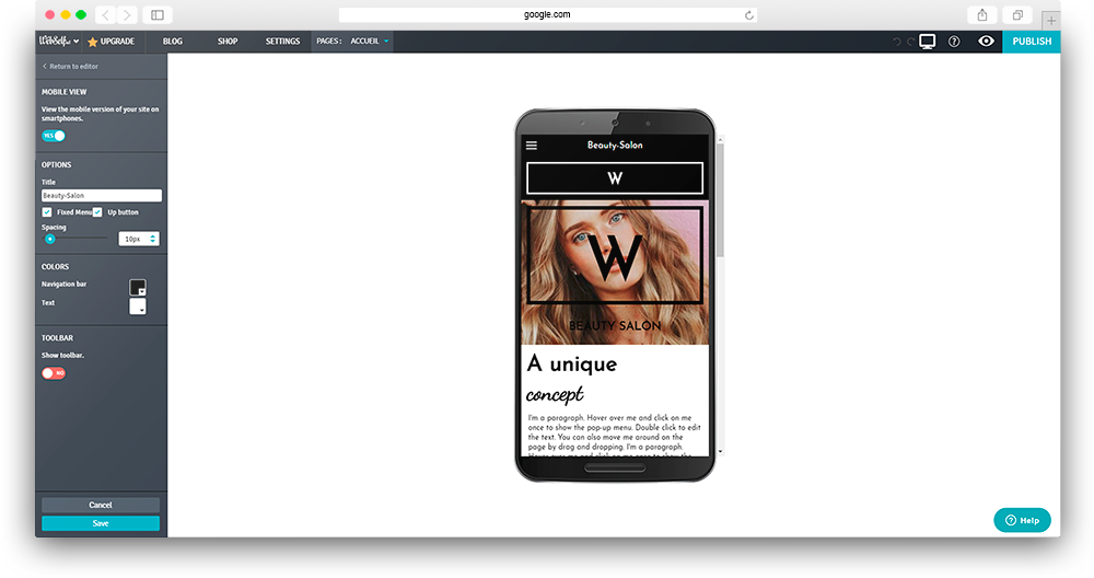
2. Activate the toolbar to be reachable more easily.
Activate the toolbar option to enter your contact information at the bottom of the screen. This will invite your customers to contact you, easily and without having to visit other pages. This option is ideal if you want to highlight your contact information right from the start.
3. Customize the navigation bar’s color for a more harmonious look.
The navigation bar becomes your whole menu on the mobile version, so it is important that it visually fits with the rest of your website. In the menu, on the side, you can choose the color of the background, as well as the color of the text.
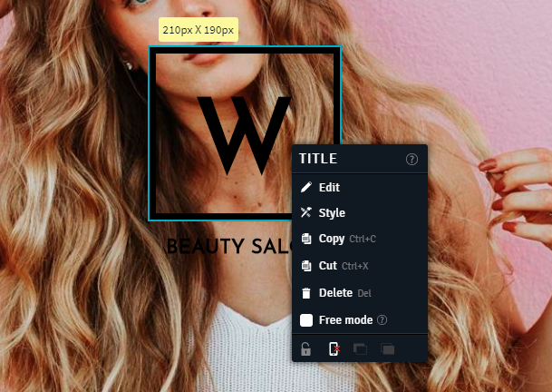
4. Make sure the content is in order.
Then, take a quick tour of the mobile version to see if some zones might be at the wrong place. Even if WebSelf automatically places the zones in order, some small errors can occur, especially for zones that are next to each other. To put them in the correct order, click and drag to reorder them easily. Don’t forget to save and/or republish your website.
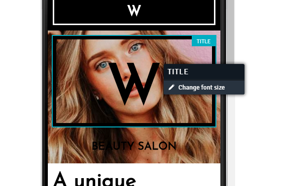
5. Adjust font sizes for good readability.
While browsing your website, notice the titles or texts, and adjust their size so that they are clearly visible and readable. If you need to edit the text, right-click on the text you want to edit, and select "Change Font Size". Use the selector to adjust the text to the desired size.
6. Remove useless content
After adjusting your website to a mobile version, you may notice that some zones, or content are not suitable for mobile, or are simply not relevant to have. In this case, you can decide to ‘’not display them in mobile version’’. To do so, click on the desired zone and display the editing menu. At the bottom of the window popup, you will see a telephone icon, just click on it once and it won’t appear on mobiles.