Contrast is essential
You've probably heard the saying "opposites attract". Well, the same thing is true when combining fonts. To have a good font combination, there must have a contrast between the two fonts. Make sure you have a good difference between your text levels for a nice typography layout, as well as good readability. Some settings you can use to create a contrast between your fonts are: bold, size or style.
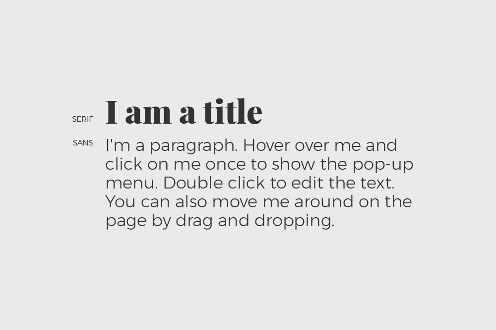
Combine a serif and a sans-serif font
A combination that always works well is to choose a serif font and pair it with a sans-serif. It's a simple combination that could make a huge difference in your website. We suggest you start by choosing a sans serif font, relatively simple (like Lato or Montserrat) and apply it to your paragraph texts. Sans serif fonts are recommended for paragraphs since their readability is optimal. Then you can choose a nice typography with serifs (like Cardo or Playfair Display) to apply to your titles, for example!
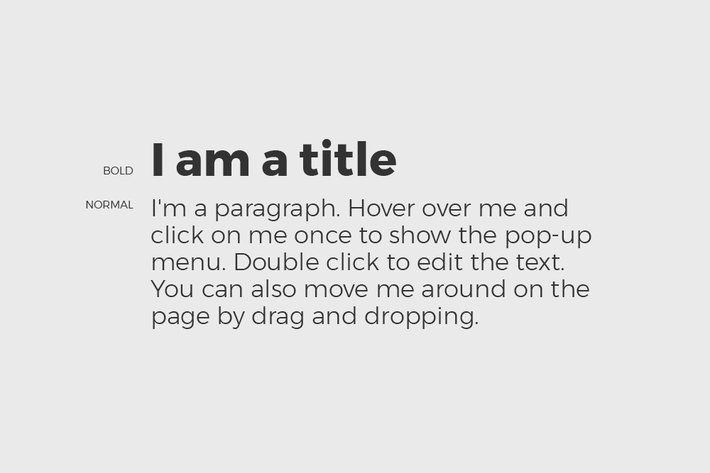
Use a bold contrast
A second combination that generally works well is to stay within the same font family, but playing with the bold or italic. For examples, all of your titles could be in the bold, and keep the paragraphs normal. This will ensure a good distinction between your text levels, and keep your layout fairly simple.
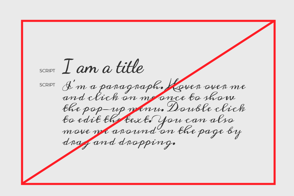
Do not combine two decorative fonts
One combination to avoid is mixing two fonts with a lot of personality. In most cases, you will end up with too much visual noise which will give you an unattractive and unreadable result. If you want to add a decorative font to your website, use it for your titles and choose a more simple font for the rest of your text This will create a nicer contrast and ensure good readability of your text.
Finally, our best design advice for your website is to keep it simple. Don’t overthink it, some combinations are simple, but they work really well. Rely on more classic combinations for your website to ensure a consistent feel. Your readers will appreciate it!
Ready to start creating your free website?