Why?
Nowadays, almost everyone has a mobile phone, and the era of the one and only feature of phones was to make phone calls is over! In fact, people use their smartphones to surf the web, download apps, order food and even watch movies. There is therefore a good chance that your visitors don’t only access your website from their computer. According to statistics, 52% of the web activity comes from a mobile device and the average time we spend on our mobile phone every day is over 2 and a half hours.
You've probably already witnessed a Google search on which you came across a site that was not optimized for your phone's screen, and it’s pretty frustrating. Constantly having to reframe the texts while searching for the buttons that bring you to other pages, we often abandon. By having a mobile version of your website, you will therefore increase your visibility and build a certain notoriety. There is nothing more professional than a neat online presence on all networks. To read more about how to take care of your virtual appearance, we advise you to read this article.
How?
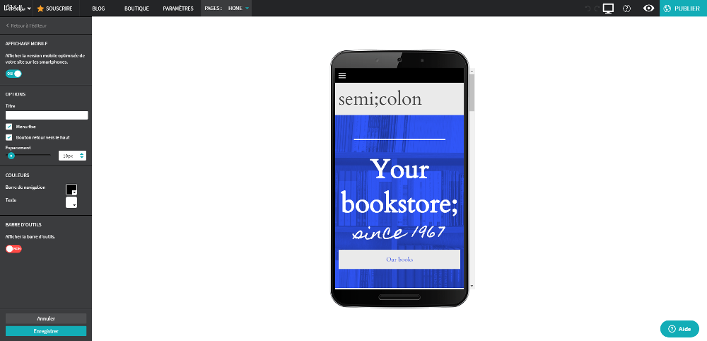
Good news! If you’ve created your website with WebSelf, we automatically create a second version that is optimized for mobile. To see it, simply click on the phone icon located at the top right corner in the editor. The best news? You can change the appearance of your mobile site from the editor, in total autonomy and simplicity. In fact, when you see the preview in a smaller phone screen, it will be possible for you to make changes and edit your pages: crop pictures, change the content order, etc.
Tip: Even if you do not intend to change anything, we suggest that you click on the phone icon and see the mobile version to make sure that it suits you and your needs: our mobile version will be optimal, but not perfect. After all, we’re not mind readers!
Bonus tips and tricks
- Use readable fonts: nobody likes to squint to read a text, even on their phone. To make your visitors experience more enjoyable, use legible fonts that are a good size: it will be easier for your readers to easily navigate your pages.
- Focus on what’s important: often, when you navigate a website from a mobile, it is because you are looking for something in particular. Remove the unnecessary images, text, etc. that will prevent visitors from getting the answers to their questions or finding what they are looking for. On the first page, indicate the services you offer, and showcase the contact page, as it will probably be the two most visited pages.
- Bet on quality visuals: in the same spirit as the previous point, bet on quality visuals that will give a good first impression to your visitors. If an image is too long, you can crop it, for example. You can also change the appearance of your pages by dragging and dropping the different sections in the desired places.
The first step to an awesome mobile site? A website with WebSelf. Start creating your free website today!