1. "Less is more"
The saying, "Less is more,” also applies to websites. Focus on what is necessary. Do less, but do it better. Choose fewer colors, but make sure they are all ‘similar,’ chosen according to your general branding and color scheme. Write less content, but make it relevant, which will really capture the visitor's attention. Above all, avoid the surplus, unnecessary icons, images, in short, all the ‘extras’ that won’t help your online success. Use spaces accordingly: this may frighten some because they feel that they are not using all the space available to them effectively. On the contrary, you must learn to like blank spaces since they come with great advantages. In addition to providing a visual break to your readers, it naturally highlights any information next to it and gives a professional and refined look to your website.
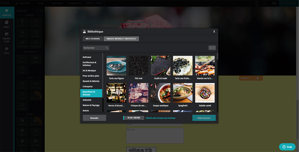
2. Use the webself library for quality pictures
A picture is worth a thousand words. Make your images speak for you and go for quality visuals. A poor quality image will quickly give a bad impression of your business to your visitors. Good news for you: WebSelf provides you with a library filled with high-quality images. An even better news: all these images are free and free for you to use on your website. In addition, you can use the WebSelf photo editor to edit all of your photos and give them a professional look.
3. Your content appearance
Readers will naturally be more inclined to read texts that are divided into small paragraphs, since these are more inviting to read. Moreover, it is proved that sentences that are too long will fatigue the eye more easily. A sentence should be no more than 10 to 15 words long. Also, the minimum size of text on the web is 14 pixels, to have a good legibility. Of course, this depends on the contrast between the police and the background, and the police itself. The important thing is to keep it descriptive, but short and clear.
4. Relevant content
Attractive visual is one thing, but don’t forget that your visitors first come to your website to find information. Although we talk a lot about the design, keep in mind that the content is more important what it looks like. Make sure you have relevant content, and you put it to good use. This is what will bring the visitor back to your website. In no case should you sacrifice readability and understanding for the look of your website.
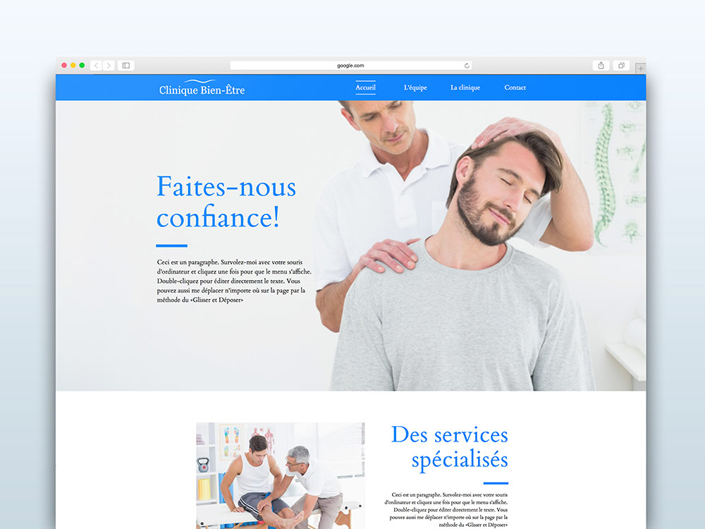
5. Use templates intelligently
Finally, although WebSelf invites you to use all of your imagination and creativity,, our templates are created to make your job easier. If you are unsure of your capabilities, simply choose the template that best suits your needs, and adapt it to your business. Our designers work hard to design those templates: you can therefore rely on them to create a website that is worthy of a pro!
First step in creating a website: select a template!