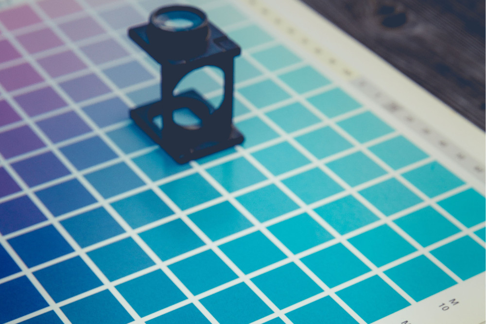
1. Choosing the right colors.
The choice of colors is very important to have a successful website. Your colors should harmonize well to add dynamism to your site. We suggest a maximum of three colors, and to use the 60/30/10 rule: a dominant color that occupies 60% of the area of your site, a complementary color that contrasts with the dominant color and occupies 30% of the surface, and an accent color that occupies 10% of the surface. It’s also necessary to choose colors that suit the tone you want to achieve for your site. For example, pastel colors normally recall sweetness, bright colors or neon remind youth and dynamism, while neutral colors give a more serious look. If you need help creating a beautiful color palette, tools like Adobe Color CC or ColourCo could help.
2. How to choose fonts.
Decorative fonts are generally beautiful visually, but are rarely practical. They are often more difficult to read and are not suitable for all situations. To choose a font, you must bet on the readability and functionality. Fonts without serif-like Arial or Raleway, are commonly used on the web for their readability and their modern appearance. On the other hand, if you want a more classic look for your website, a serif font like Cardo, for example, would be an excellent choice. For more information about how to correctly choose your fonts, read our article on the topic.
3. Choosing the right media.
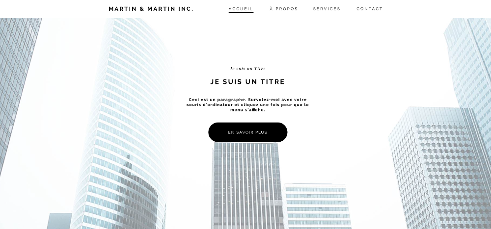
Of course, pictures add a lot of visual appeal to your website, but on the other hand, you must ensure that they are of good quality because blurry photos takes aways all professionalism you are trying to portray on your website. In addition, the large background pictures are very popular but to add value to your home page, the picture needs to be big enough so you don't lose quality and it's not blurred when in full size on a desktop computer.
4. Do not overload.
While it is tempting to fill all available space with the most information possible, it will not help your users find the information they are looking quickly. It is better to stick to the most important information, and to structure your content. Also, don't be afraid to leave white spaces, it makes your layout 'breathe' and adds even more value to the rest of your content.
5. Be consistent.
Your website must be in continuity with the rest of your brand. We must feel in the same direction as your logo or your business card. To feel a certain cohesion between the pages, we must find close to the same type of layout, the same alignments and a similar structure so the user knows that they are still on your website!
6. Make sure you have good visibility.
Above all, the design of your website should showcase your content, it should not distract your user. If you decide to use a photo as background, you will have more difficulty to add text directly on it. To make it easier for your visitor to read, it must be bigger and contrast on a plain background. Make sure the information you want to communicate is valuable, and that is it organized so that your users do not have to search very long to find what they are looking for.
7. Keep up with industry trends
Finally, to get your website on top, keep up with the latest trends. For example, big trends these days are "flat design,” and "long scroll" which is condensing your content over a very long Home Page. You can even go take a look at our pinterest account to see the latest design trends, and many other tips to improve your website.