Functions
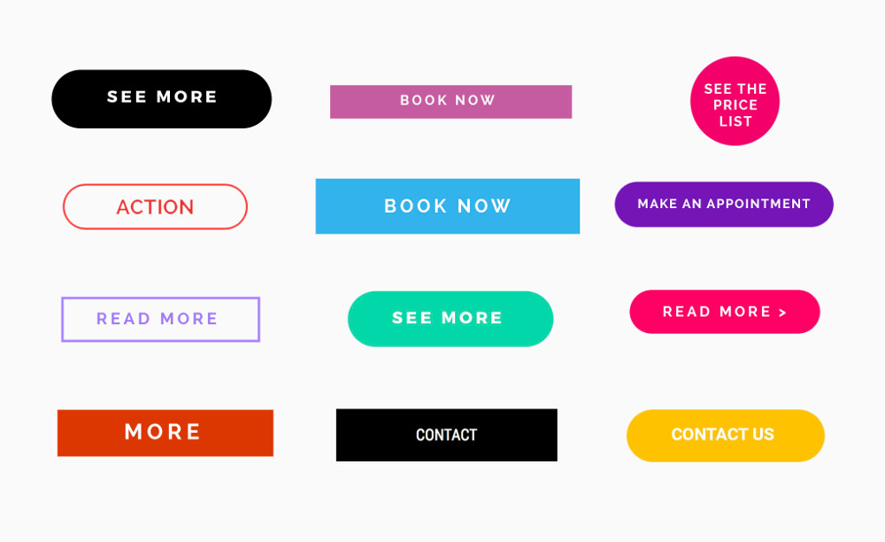
The call-to-action buttons have multiple functions.The name says it, the main purpose of the button is to encourage visitors to perform an action, therefore doing something on your website. For these "buttons" to be effective, it is important to consider what goals you want to achieve. For example, increasing the rate of conversion to other links pages or increase the number of people who sign up to your newsletter are examples of good, reachable goals. The target audience, color, choice of words and the nature of the action can all play a role in the effectiveness. It's a simple button after all, but the details and the changes you can do could make all the difference. Here are some examples of buttons that you can find in our templates.
The location
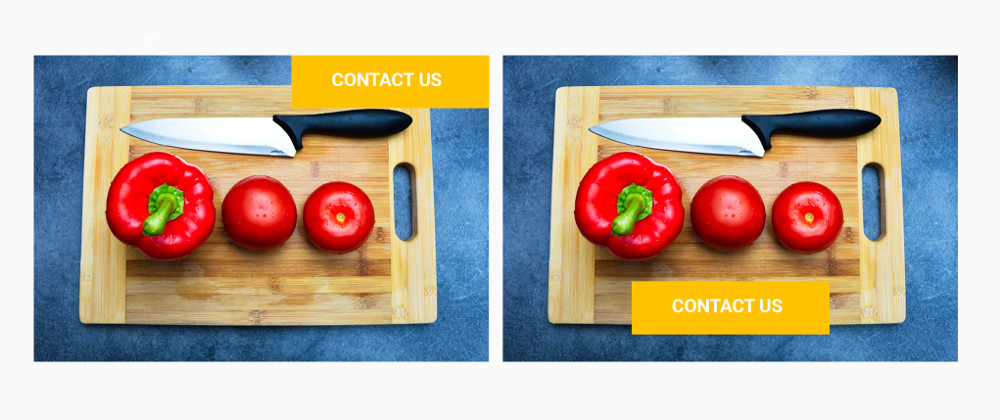
A call-to-action button should be positioned in a strategic location to maximize the CTR (click to rate) of your visitors. A button that gets no click is probably not placed well on the page. Ideally, it should be visible: it should be one of the first elements that people notice when they arrive on your website. If you do some research on the internet you will probably find statistics or rules about the click to rate ratios, etc. There is no miracle: the ideal is to test it. When you create your website, try placing them in different areas and choose the location where you would be most inclined to click yourself.
Color, shape, font
Effective CTA buttons should be visible. Therefore, use colors that differ from the rest of your site, but that are still complementary to it. The color selection is important because it contributes to the effectiveness of your message. For example, if you are a law firm, it would be preferable to use classic colors like navy blue or even black before the red, which can be perceived as a violent color.
For the shape and font of the button, it's all up to you! Make sure to use a readable font and your buttons are not too small nor too large. Generally, the size of the text's font should be slightly bigger than the rest of the text, to captivate the attention and redirect your readers to a relevant link.
Pro-tips
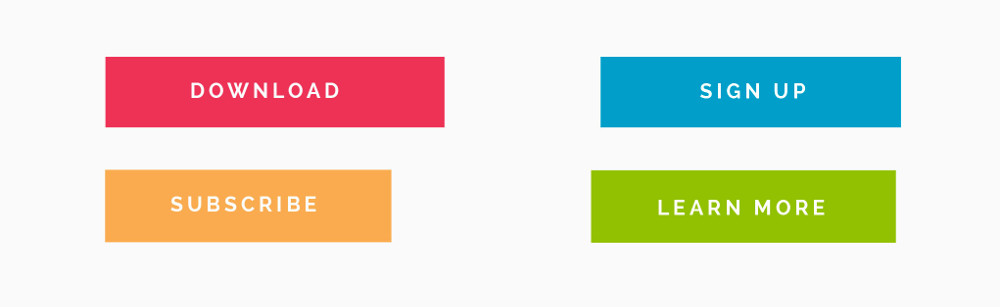
- Use action verbs such as Download, Sign up, Subscribe, Learn more.
- Visible: Your buttons will need to be visible if you want people to click on it. Make sure you maximize the CTR by choosing a smart location.
- Short: most of the time, one or two words are enough.
- Efficient: Use unique colors and play with contrasts.