Plan your structure
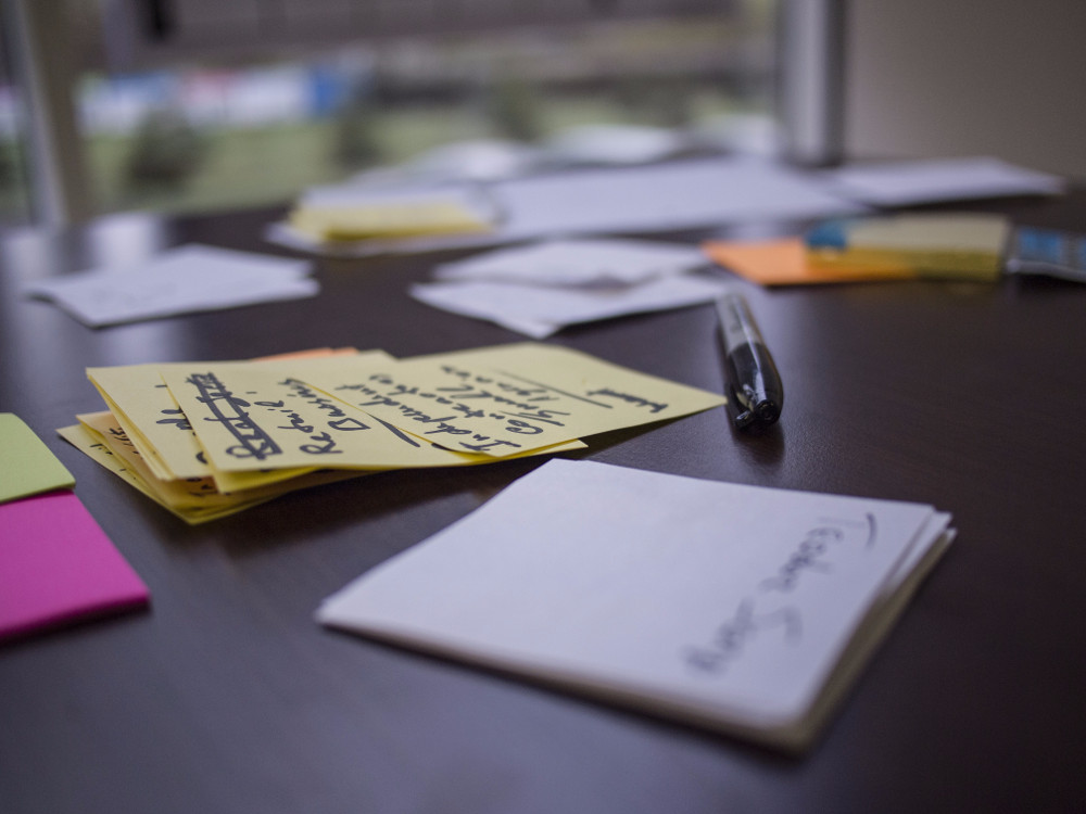
Before you start anything in the WebSelf editor, it is strongly advised to start on paper. Plan what content will appear on what page, and how it will be structured. We call this: content architecture. Start by making a list of the content you want to appear on your website, and then divide it into pages and subpages, if needed.
A few tips to keep in mind:
- Have only one key point per page. This will greatly help the user to find the information he’s looking for.
- Use short, accurate names for your pages. Make it easy to understand what information is where
- Get inspiration from a WebSelf template that fits your business: content is already divided into relevant tabs.
Define a clear message
As mentioned above, defining a single message per page is very important, especially on the homepage. Remember, you need to make a great first impression, so think about the main reason why a visitor would land on your website, what information he's looking for and use it to divide your content intelligently.
For example, if you’re a hairdresser. Put your phone number, or a button to make appointments at the bottom of the page, or where it’s easy to find. An online shop? Display your featured articles on your homepage, with a call to action button redirecting them to your store page.
Make sure that the main information your visitors are looking for is highlighted in the main menu, or with a call-to-action button in the first section of your homepage. For an effective homepage, we advised you to keep it simple, with an eye-catching phrase, a beautiful image, and an effective call-to-action button. This will clearly highlight the most important information.
Content is king!
Now that your content is clearly divided, it's time to start giving life to your website. Keep in mind, when you’re building it: the container is at the service of the content, which means that the design of your site must never come to disrupt the visitor's understanding. Never sacrifice good legibility for a font that you find pretty or colors that don’t highlight the content.
Tips to keep in mind:
- Never go below a size of 14 pixels for your text
- Use two colors that contrast well together your texts: a lighter and a darker one. This will ensure you readability.
- If you want to put text on an image, make sure that your text is large enough for a good understanding.
- Keep the design simple, so that the focus is on the content.
Make sure all links work
A good navigation through your website is very important. For the visitor to have an excellent user experience, he should never feel lost. He must, at all times, know where he is and where he can go next.
Some ways to do this:
- Highlight your links, making them a appear with a different color than the regular text. Your visitor will know where to click.
- Put a link on your logo in your header that redirects to your homepage. People usually tend to click on a logo to return to a homepage if there is a link.
- Set a different appearance for the tabs in the menu. This will allow visitors to easily navigate through your website.
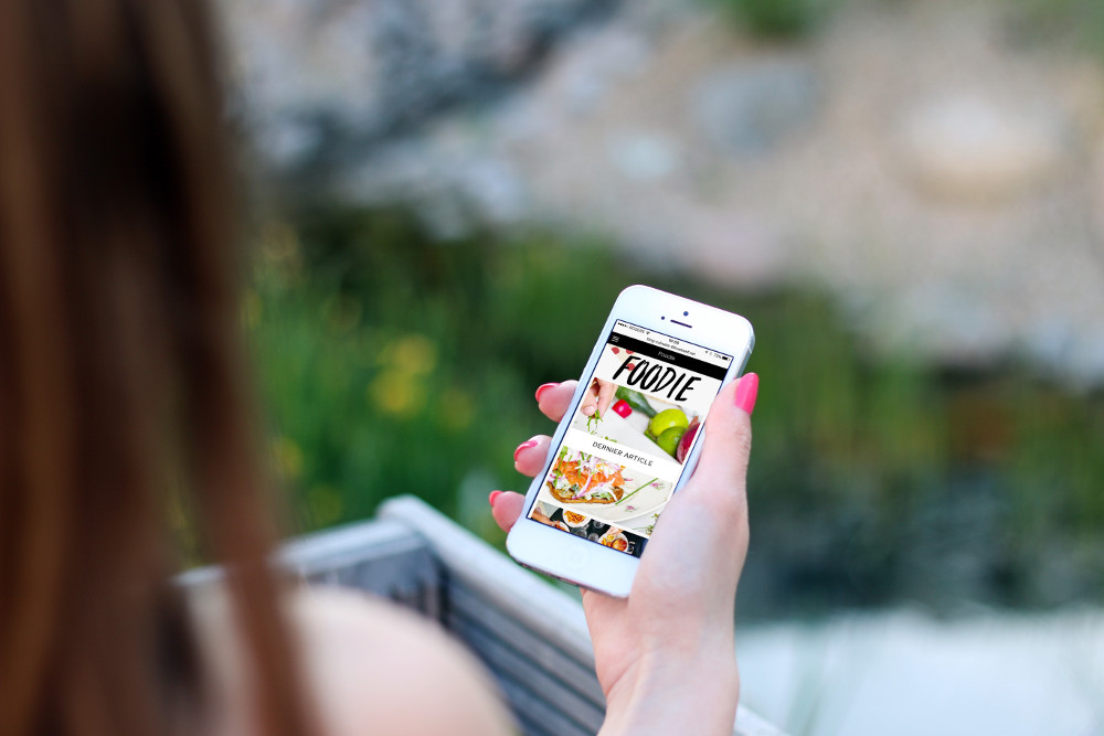
Make sure you have a mobile version that is optimized
In 2016, mobile traffic exceeded the desktop’s for the first time. (Source) Indeed, more people are browsing websites from their mobile than from a desktop computer. It is therefore very important to have a website that is optimized for mobile, and is as effective as the desktop version.
Luckily, WebSelf automatically adapts your website to mobile, but it's always better to check the result by clicking on the smartphone icon at the top right of the editor. You can manually change the order in which objects appear and change their size, as well as delete some content directly from the editor.
Your idea deserves a great website! Start today!