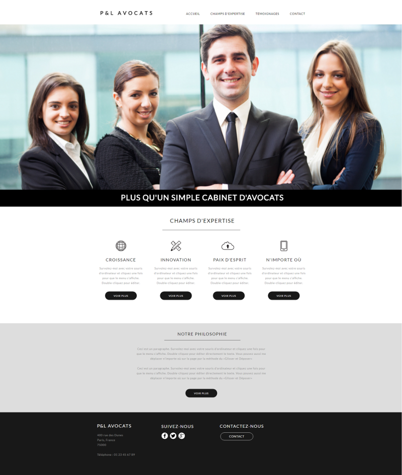
1. Get inspired by our templates
Our designers work very hard to create templates that will meet everyone's needs. Whether it's for a portfolio, a bakery or a law firm, WebSelf has a template for you! Of course, you can also start from a blank one if you have a good idea of what your site will look like. Alternatively, let us inspire you with our wide selection of templates: choose the one that best represents your business and edit some elements, such as your description, your contact information and add your personal touch with quality images.
2. Get rid of all the extra
Your website should be beautiful, but also informative. Use blank zones to let your website ‘breathe’ , hence giving it a professional look. Your primary goal is that your visitors quickly find the information they want and want to learn more. That's why you have to remove the extra, shorten your endless texts and focus on powerful keywords.
3. Organize your site with tabs and sub-tabs
A 'one-page or 'long-scrolling' site can be interesting when you have little content, since it consists of concentrating it on a single page, but when you have more information to share, It is preferable to divide it into several pages.
Group your information into different pages, and then divide them into tabs and sub-tabs on your website. You can even create sub-sub-tabs, which will make browsing on your web pages easier and enjoyable!
For example:
- Tab 1: Contact
- Tab 2: Services
- Tab 3: About
- Sub-tab 1: Blog
- Sub-tab 2: Our Story
- Tab 4: Contact
Tip: Since it is said that a visitor will read only 28% of the text that he sees on a page of a website, it is preferable to shorten your texts or even to write them in the form of lists! If you offer several services, for example, make a list, which will be easier to read than a long text. Also pay attention to illegible fonts and words that are too difficult to understand: keep your texts simple and informative.
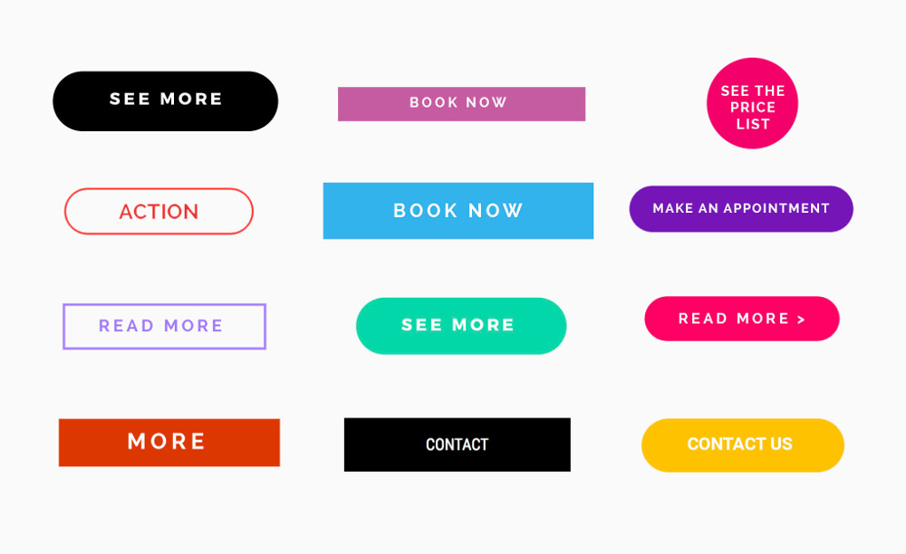
Bonus! Add call-to-action buttons
A call-to-action (CTA) button is a message, button, or image that prompts visitors to your site to perform a defined action. For example, it can be an application download, a link to another page, a contact request or a newsletter subscription. Adding these buttons primarily helps the user navigate the different pages of your site, thus improving ease of use.
You have a great idea? Start your personalized, beautiful website today!